
An airline’s logo forms an integral part of its overall identity, with some even achieving iconic status. Key.Aero examines the development of some of the biggest names in the business
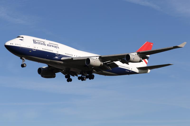
British Airways
Founded in March 1974, British Airways was set up following a merger between British European Airways (BEA) and British Overseas Airways Corporation (BOAC).
The beginning of BA marked the completion of a consolidation process started in 1971 with the establishment of the British Airways Board, a body created by the UK government to control the operations and finances of BOAC and BEA.
When it launched, it did so with a very simplistic livery that simply showed ‘British’ in title case and ‘airways’ in lower case. Many onlookers thought it lacked the sophistication that the new flag carrier deserved.

In 1982, a new brand developed by Landor Associates was unveiled. It portrayed sophistication and elegance; two things many thought its predecessor lacked.

In 1997, the company’s present corporate identify was revealed. Created by Newell & Sorell, the new brand kept a similar font to the Landor design but integrated a ribbon that is a distant echo of the Speedbird symbol first used by Imperial Airways in 1932.
Delta Air Lines
Atlanta-based carrier Delta Air Lines has had 20 different iterations of its logo since its inception in 1928. However, since 1959 all designs have included its now-iconic delta-shaped “widget”. The icon was introduced to promote its first jet service with the Douglas DC-8 that year.

Between 1959 and 1965, Delta used a sideways mounted widget which was supposed to represent the speed of jet services. Various configurations of the design were used between 1960 and the 1990s with little change.

In 1987, the carrier thinned the font it used and stretched it vertically for the first time. In 1995, the firm altered some of the colours it utilised and introduced a much rounder font. Between 2000 and 2004, Delta softened the widget’s edges and lightened the shade of blue.

For the next three years, a “heritage widget” was adopted, based upon employee feedback and nostalgia associated with Delta’s 75th anniversary in June 2004.

Its present logo features a three-dimensional red widget and was launched on April 30, 2007.
American Airlines
No stranger to consolidation, American Airlines was formed in 1934 following the grouping of some smaller carriers. Its first logo, which it carried for 11 years, featured an eagle and the letters ‘AA’ in a red font on a blue background.


In 1945, American adopted a new blue logo with the eagle flipped the other direction. In 1962, the eagle was dropped, and the full name of the carrier was used for the first time. Its latest logo was born out of a merger between American and US Airways Group in 2013. It was announced that they would combine and retain the iconic American Airlines brand with a new logo.
United Airlines
Founded in 1930, United Airlines started life with a simple that included the words “UNITED AIR LINES” and a map of the US. In 1933, the map was dropped, and the block titles were made larger.

Variations involving a shield and stars then followed, before in 1961 the shield disappeared and in came a vertical spike.

In 1974, this iteration was replaced with a stylised “U” slanted at 68 degrees. The company retained the design until it acquired Continental Airlines in a merger in 2010 and adopted the firm’s globe icon.


In 2019, the design was refined with a darker shade of blue and fewer windows on the world.
Air France
Beginning operations in October 1933, Air France’s first logo featured a winged seahorse with a dragon’s tail. In 1976, the brand underwent a dramatic change to include one red and four blue slanted lines.


A black underscore was introduced in 1990 and removed in 1998 when the logo was stretched. In 2009, the four blue lines were removed, and the red line was stylised.
Lufthansa
The German flag carrier Lufthansa is unique in the fact it has only ever had four iterations of its logo, all of which have been very similar to each other. The main feature of the design is the flying crane which has been on all its logos since 1918.


For more than 50 years from 1963 to 2018, Lufthansa’s logo included a blue flying crane on a yellow background. In 2018, the company decided to overhaul the design by changing the centrepiece to white and introducing a dark blue background.
KLM
The Dutch flag carrier KLM, which turned 101 this week, has had essentially the same logo since 1961 when it introduced the crown icon with four dots. Since then, the colours have been refined and are now a light shade of blue.


The addition of the words “Royal Dutch Airlines” was made in the latest iteration which was introduced in 2011. The inclusion of that phrase hadn’t been seen since its 1950 logo and brand design.